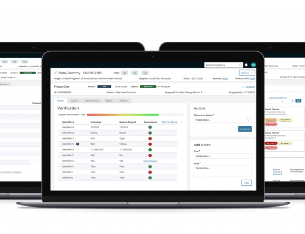
Product Design System
design system, screen inventory, screen map, patterns library
No 1 Overview
An initiative to amplify the product design system to include a screen inventory, screen map, patterns library, components library and structures library. The purpose of this UX artifact is to support future development efforts and establish alignment between designers, agile scrum teams and product managers.
To comply with my non-disclosure agreement, I have omitted and obfuscated confidential information in this case study. Names have been changed for privacy as well. All information in this case study is my own and does not necessarily reflect the views of Accenture Song or Accenture.
Client
A government agency is developing a B2B web based software for internal use by employees.
Design Team
1 Project Manager, 1 Design Manager, 1 Visual Designer, 2 Interaction Designers, and User Experience Designer (me), 2 Front End Developers
Project Type
Product Design, Service Design, UI Design
Platform
Desktop web application
No 2 Client Requirements
Current State & Future State Development Clarification
Provide a single source of truth for all stakeholders, including product managers, developers, and agile scrum teams, regarding the current structure and future vision of the system.
Universal Alignment
Establish alignment between agile scrum development teams and stakeholders on where each element lives in the system. There is a lack of awareness on which areas need revision or are in progress.
Record User Roles & Access
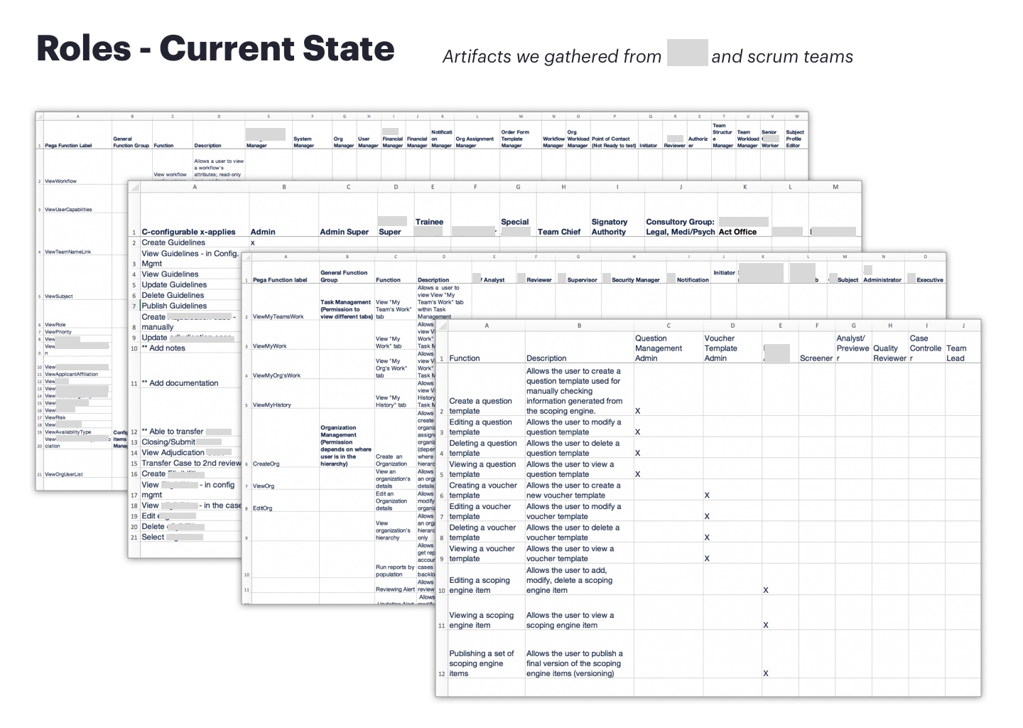
Account for all types of user roles and what type of system access they will have
Eliminate Design Inconsistencies
Remove any design disparities through out the system to ensure design cohesiveness
Streamline Transparency
Reduce wasted development time around miscommunications
Deliverables
Screen inventory and screen map of current and future state, design system expansion
Product
A comprehensive product design system that includes a screen inventory and screen map of current and future state features, information architecture, patterns library, components library, structures library, accessibility guidelines, and design tokens
No 3Challenges
Evolving Requirements
Managing evolving requirements and ensuring the product design system remains relevant and up-to-date throughout the project lifecycle.
Ensuring Design Consistency
Examining what areas of the system were built and what will be built and areas where the user interfaces or user experience are inconsistent.
Absence of Framework
Establishing information architecture to provide guidance for product development.
Improve Ways of Working
Increasing design and development efficiency so resources can invest more time in complex problems and solutions.
No 4The Approach
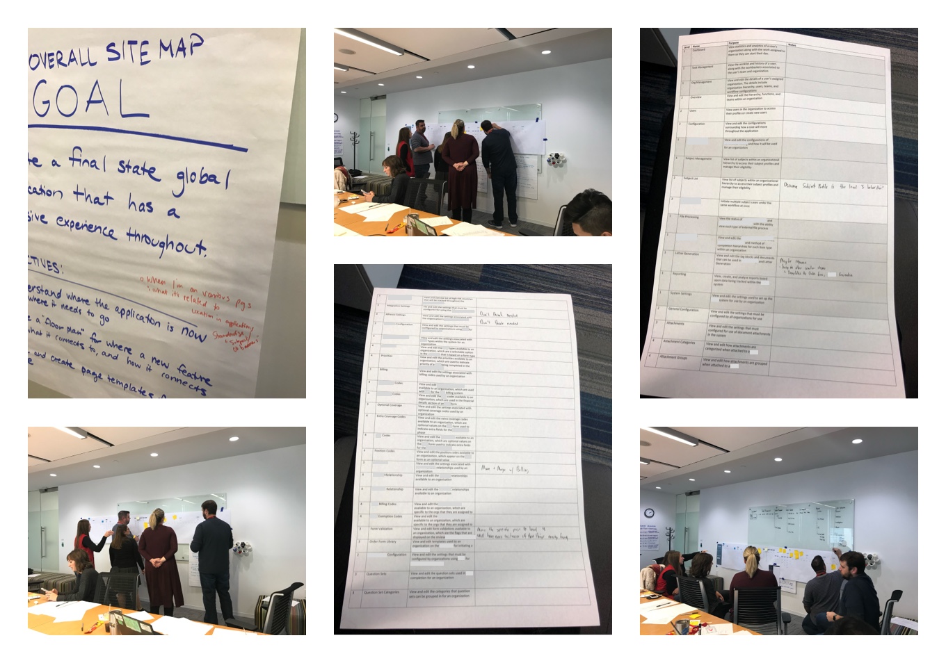
Stakeholder Workshop
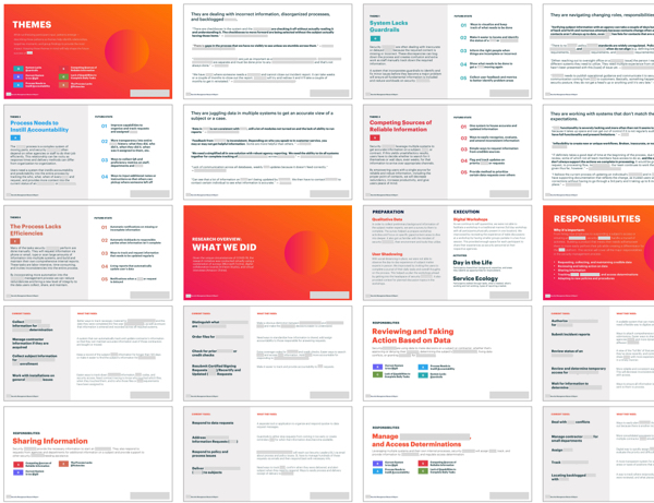
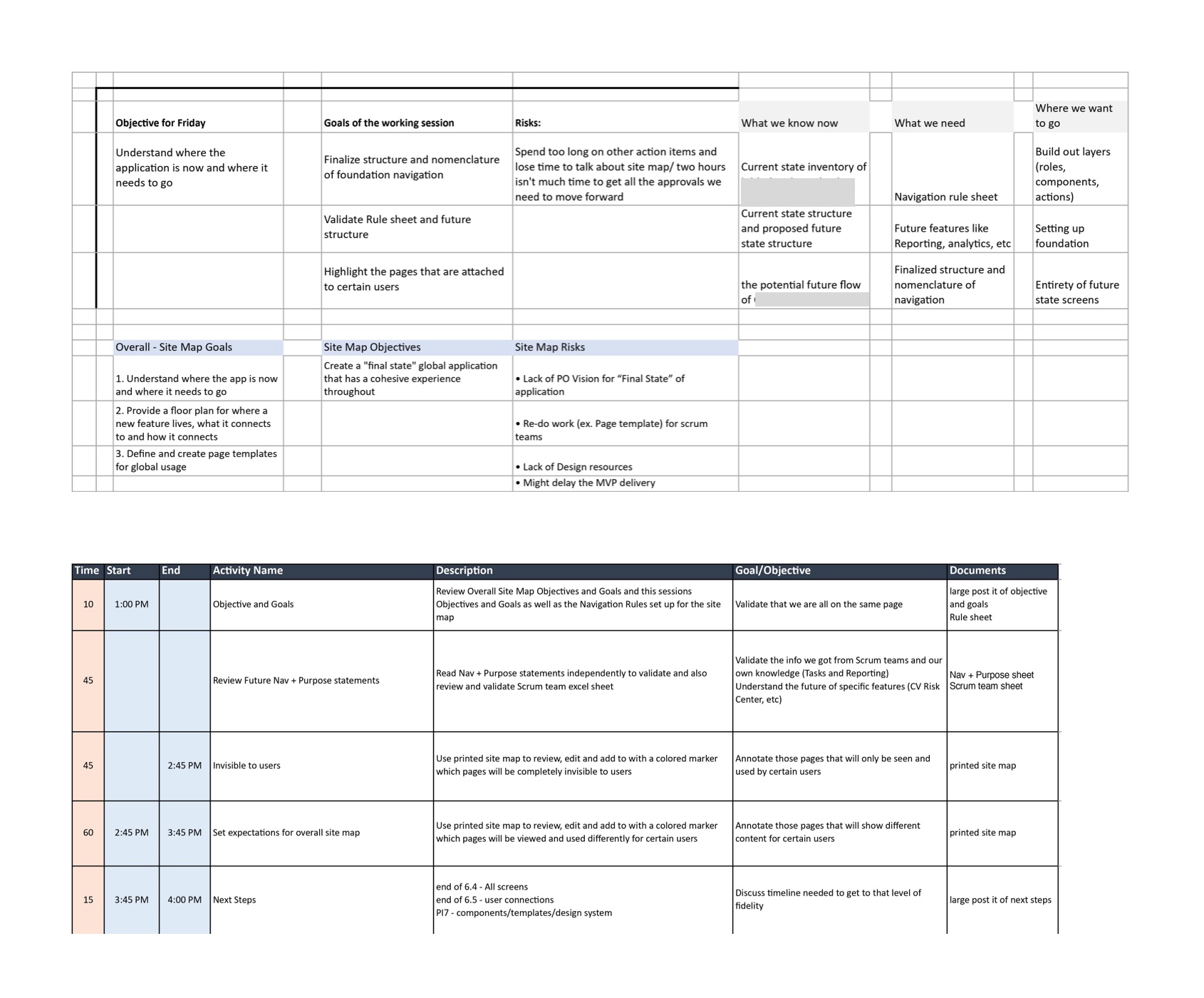
Conducted an alignment workshop with key stakeholders to gather insights on their needs, expectations, and pain points regarding the current system structure. Defined the desired future state of the system and aligned on expectations.
Current State Analysis
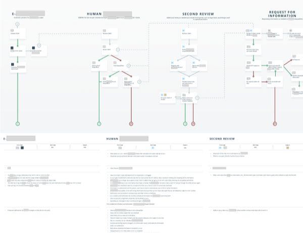
Conducted a thorough UX audit of the existing system to document its current structure, functionality, user flows and where everything lives. Identified areas of improvement and gaps in the user experience. Based on what was found from the audit, a screen inventory was made.
Future State Planning
Collaborated with stakeholders and product owners to define the desired future state of the system, including new features, enhancements, and potential redesigns.
Stakeholder Workshop Objective and Agenda
Screen Map Creation
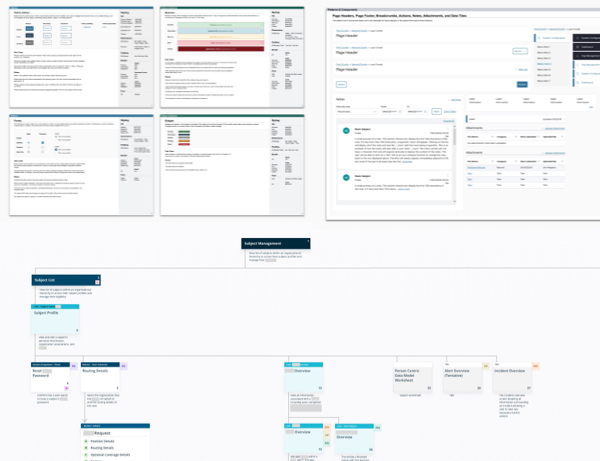
Developed a detailed screen map that includes both the current and future states of the product. Identified recurring patterns, structures and components in various areas in the system. This visual representation covered all key components, pages, tabs, modals, and interactions within the product. The screen map also outlines the purpose and user access for each element.
Refine and Revise
Shared the initial screen map with stakeholders and collected feedback. Iteratively refined the screen map based on this feedback to ensure it met all requirements and addressed any concerns.
Expand Design System
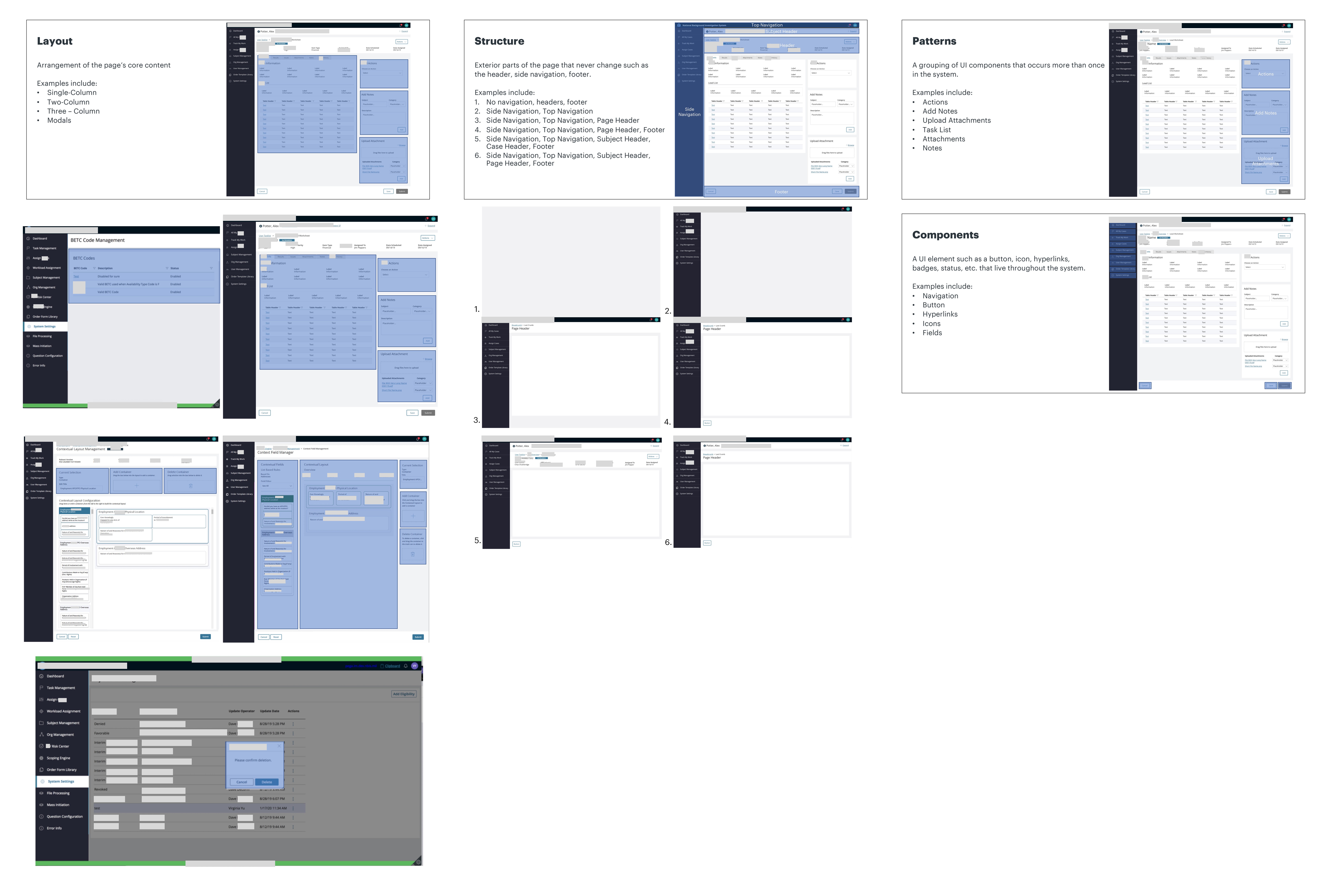
Incorporated a patterns library, components library and structures library into the current design system.
No 5My Process
UX System Audit
In order to thoroughly understand the current state of the product and identify future state opportunities, I collaborated with developers and product owners to gather insights on current features. During these workshops, we aligned on what has been built, what needs to be built, and what needs to be redesigned. All inconsistencies across the system were documented and noted for future developments.
Screen Inventory Creation
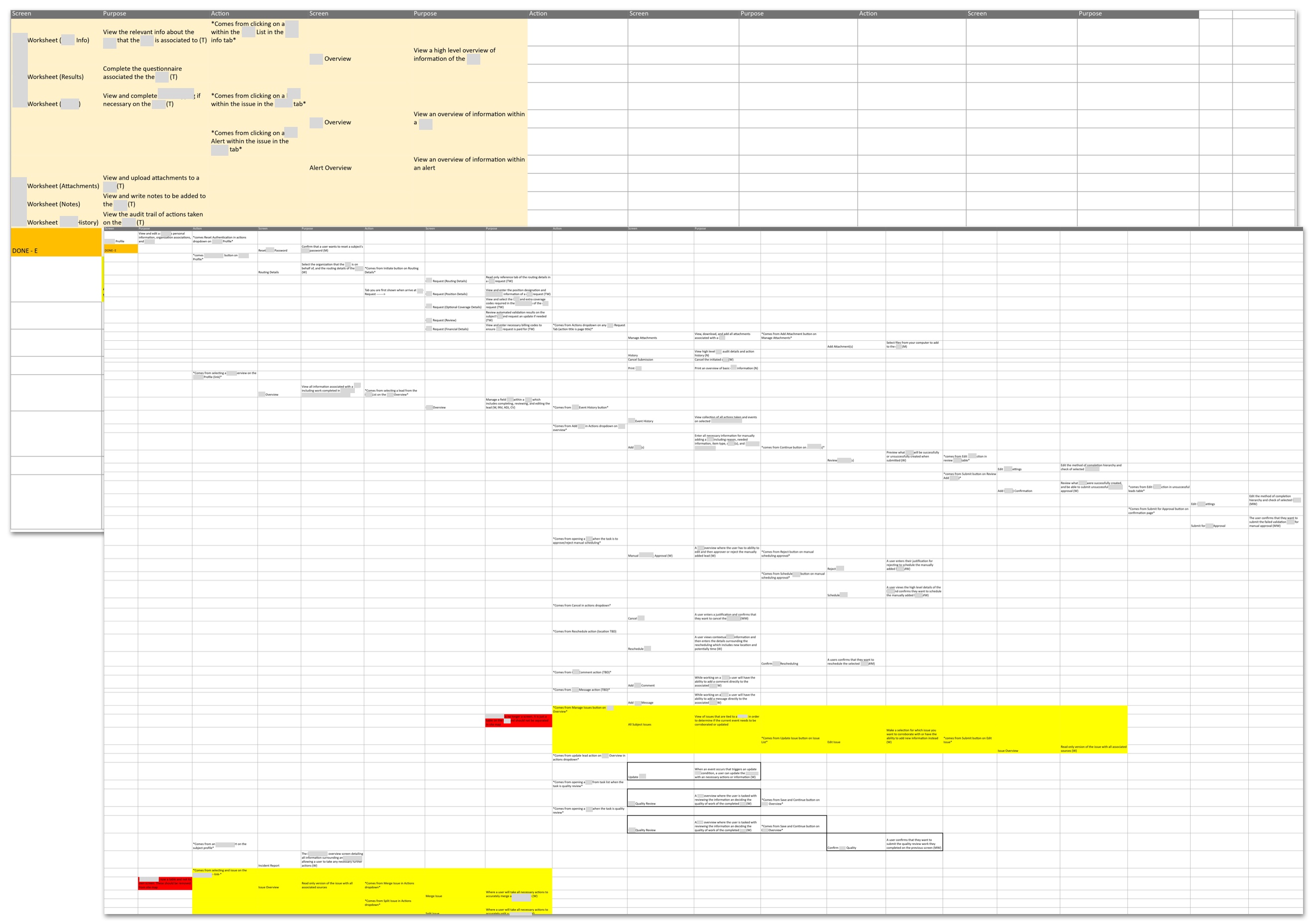
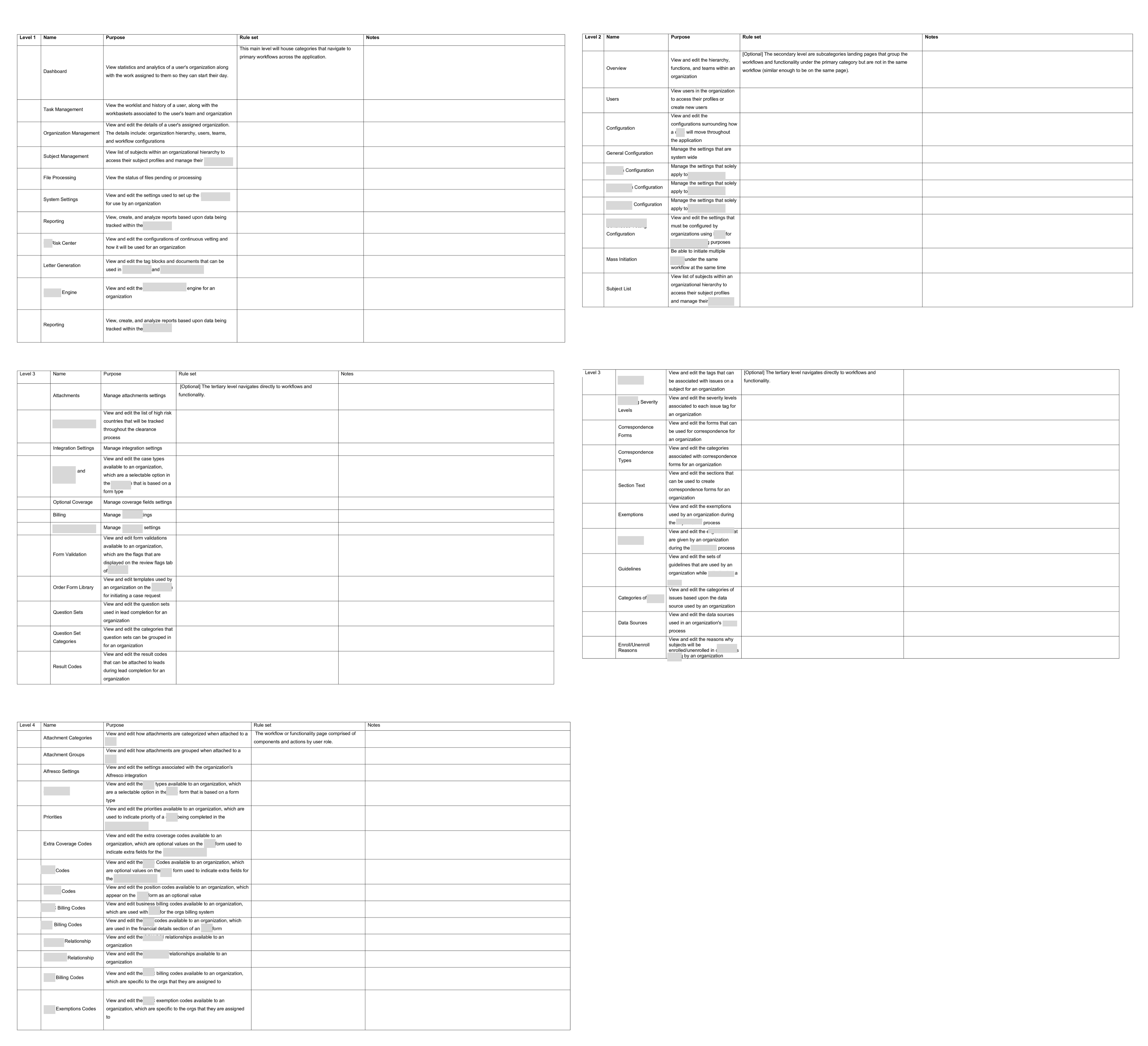
I created a comprehensive inventory of all the screens within the system, documented the purpose for each screen and component and which users would access it. By doing so, we were able to understand why each screen and component was necessary in the product.
Inventory of screens
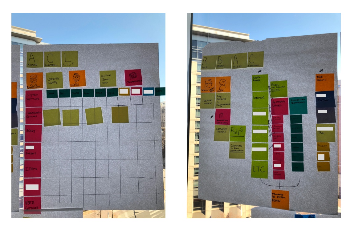
Inventory of User Access
Inventory of Roles
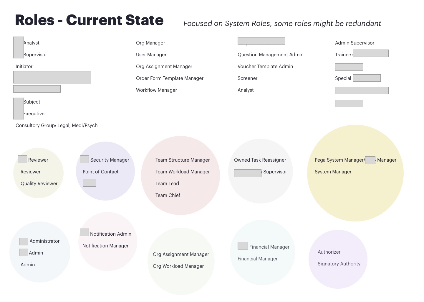
Brainstorming session for user access in future state
Screen Map Design
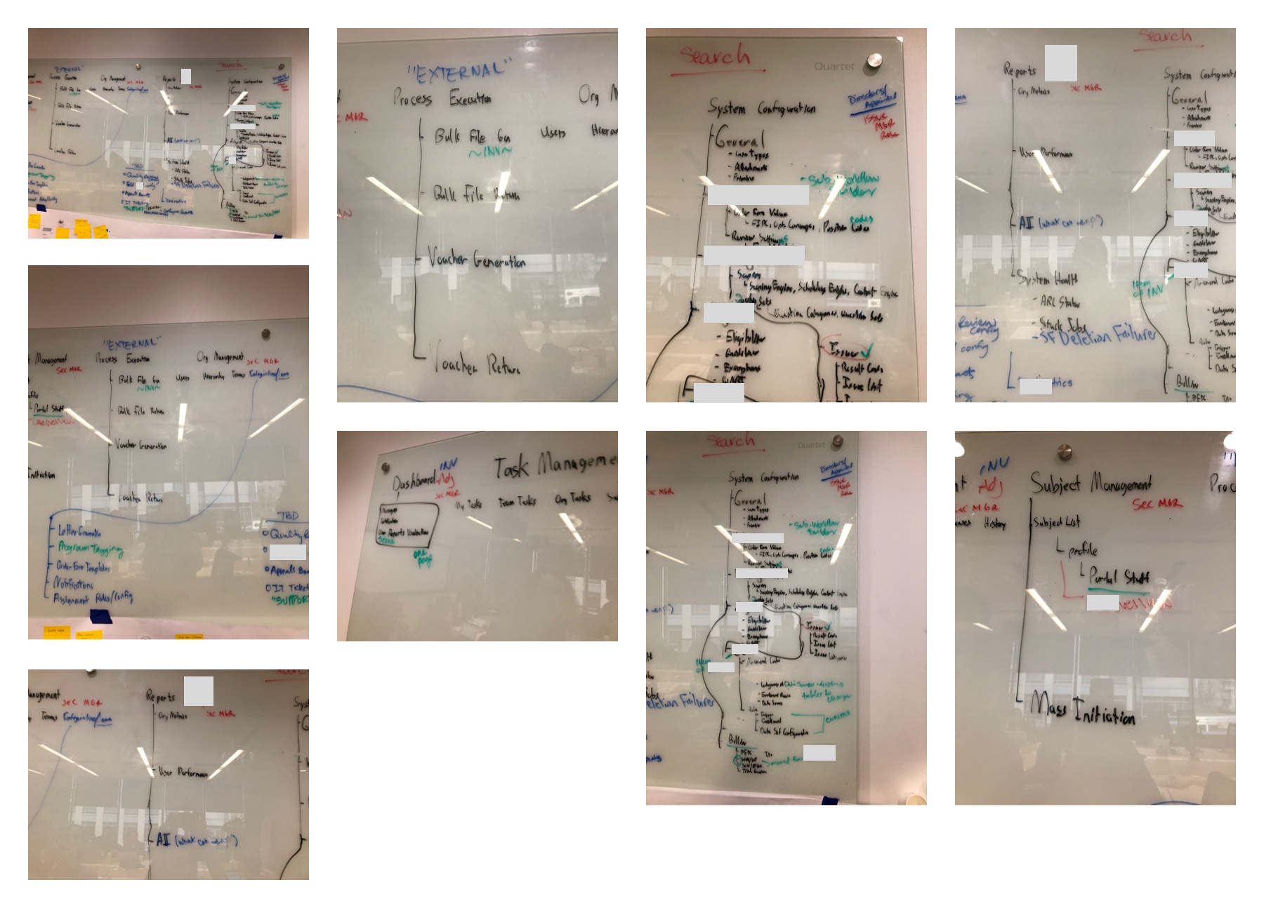
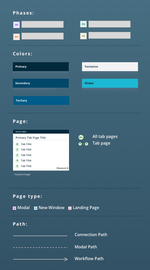
Based on the data and research gathered, I worked with a visual designer to transfer over all this information to a visual diagram. We began drafting the navigation paths and screen flow and visual elements for the site map. During this process, we identified user flows and design elements that repeated often in the system, they were documented as patterns, components and structures. This was incorporated into the design system.
Ideation session for screen map structure
Screen map hierarchy
Visual elements for screen map diagram
Review and Revise
After completing the screen map, I presented it to the product owners for feedback. Based on the feedback received, I made revisions to ensure the screen map accurately represented the requirements for development.
Expand the Design System Guide
I integrated the patterns, structures, and components into the design system to expand its utility further.
Share Out
I presented the revised product design system to scrum teams to create alignment between our work streams. We reviewed how the new product design system should be utilized in development efforts moving forward. The documentation was shared out with all project members and stakeholders. Moving forward the revised product design system will provide a crystal clear framework for teams to better understand development requirements.
No 6The Solution
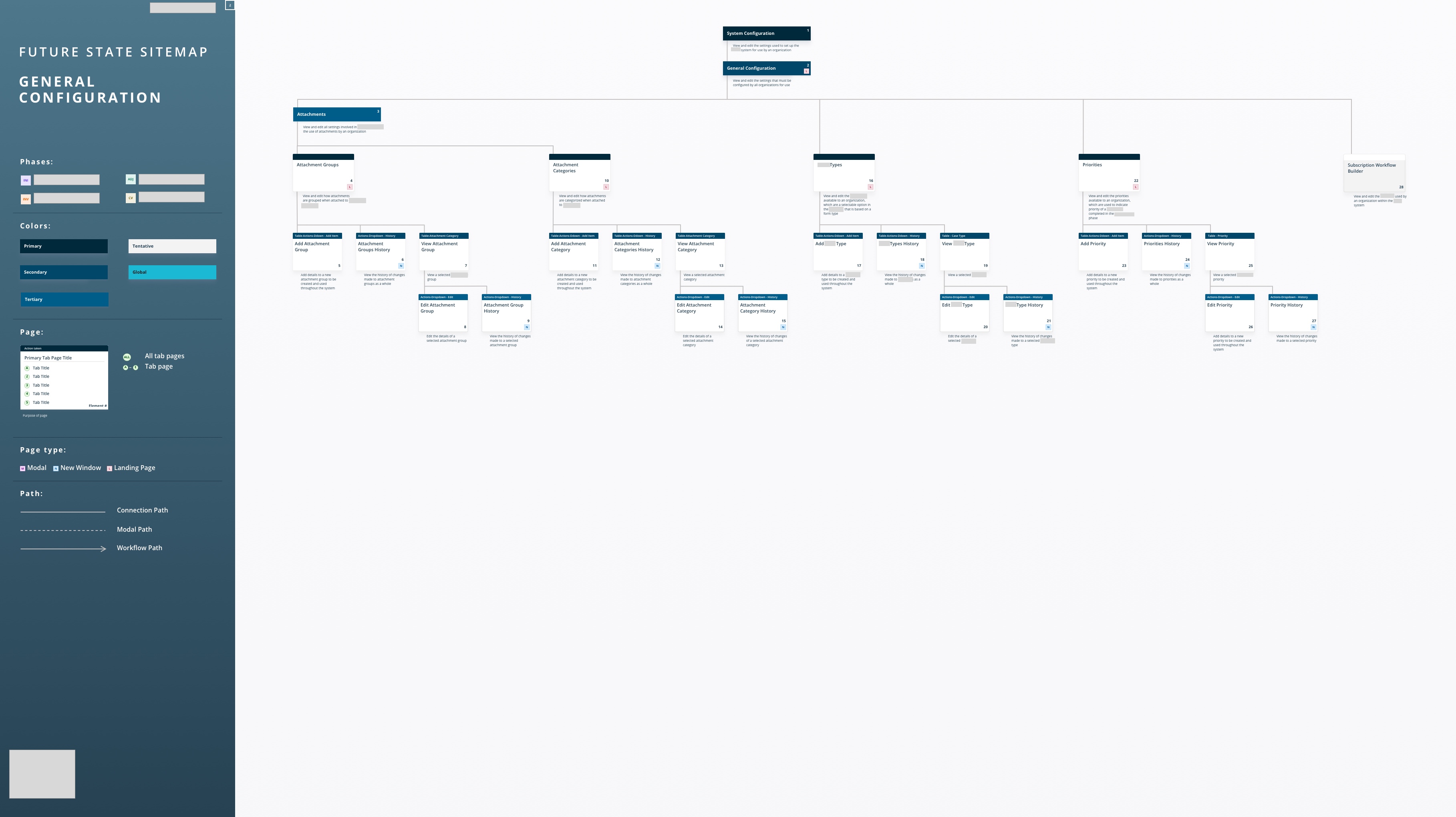
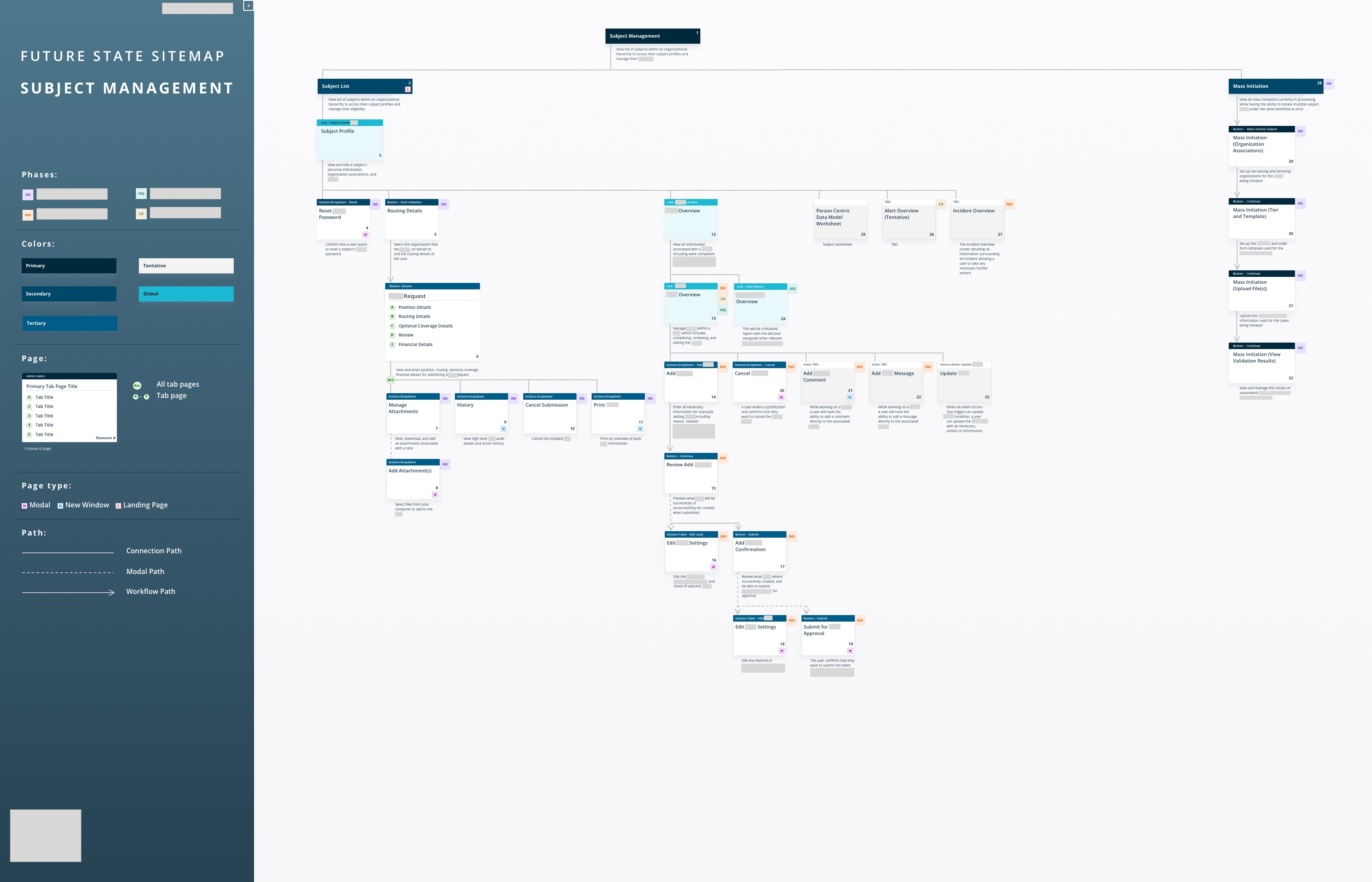


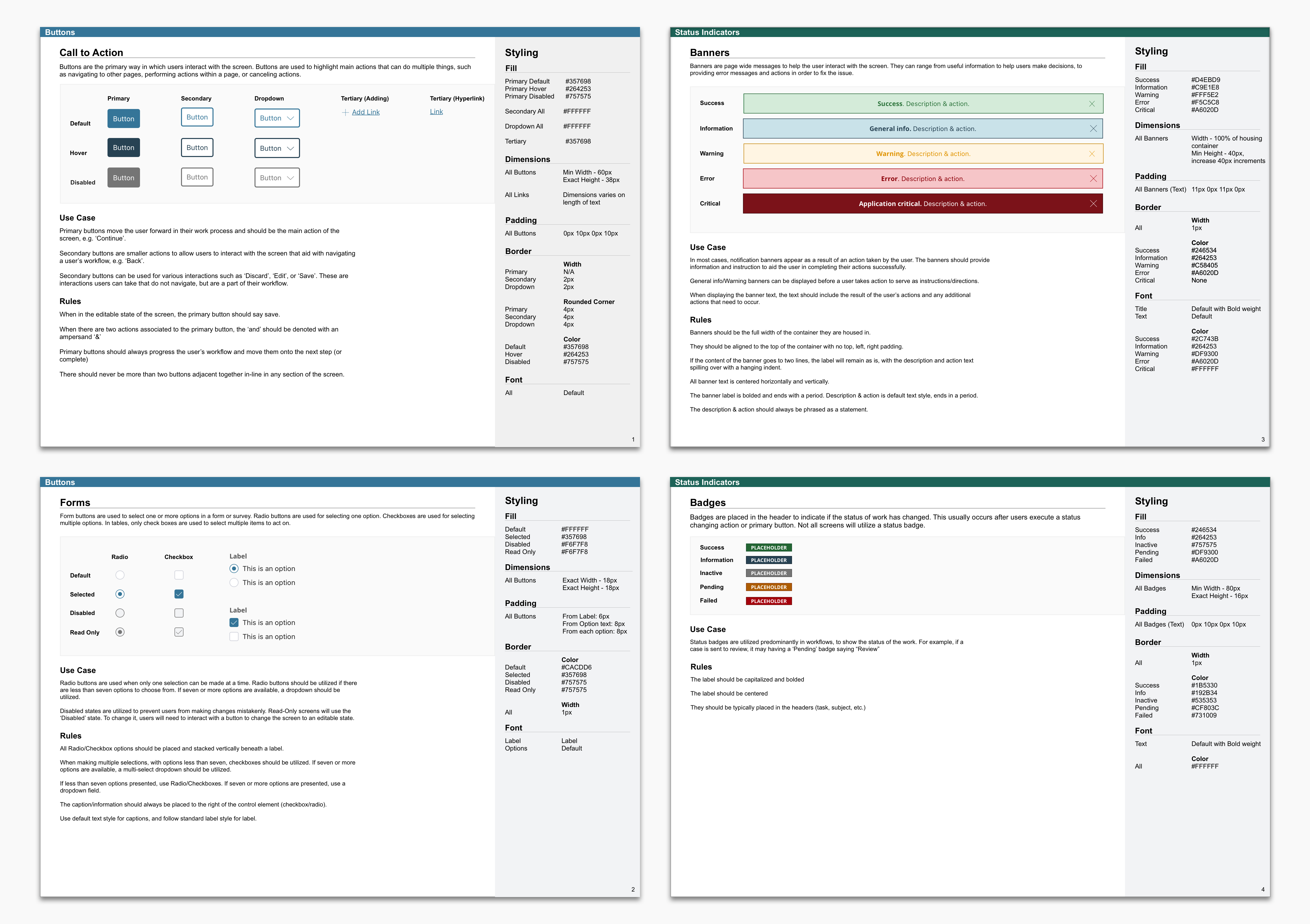
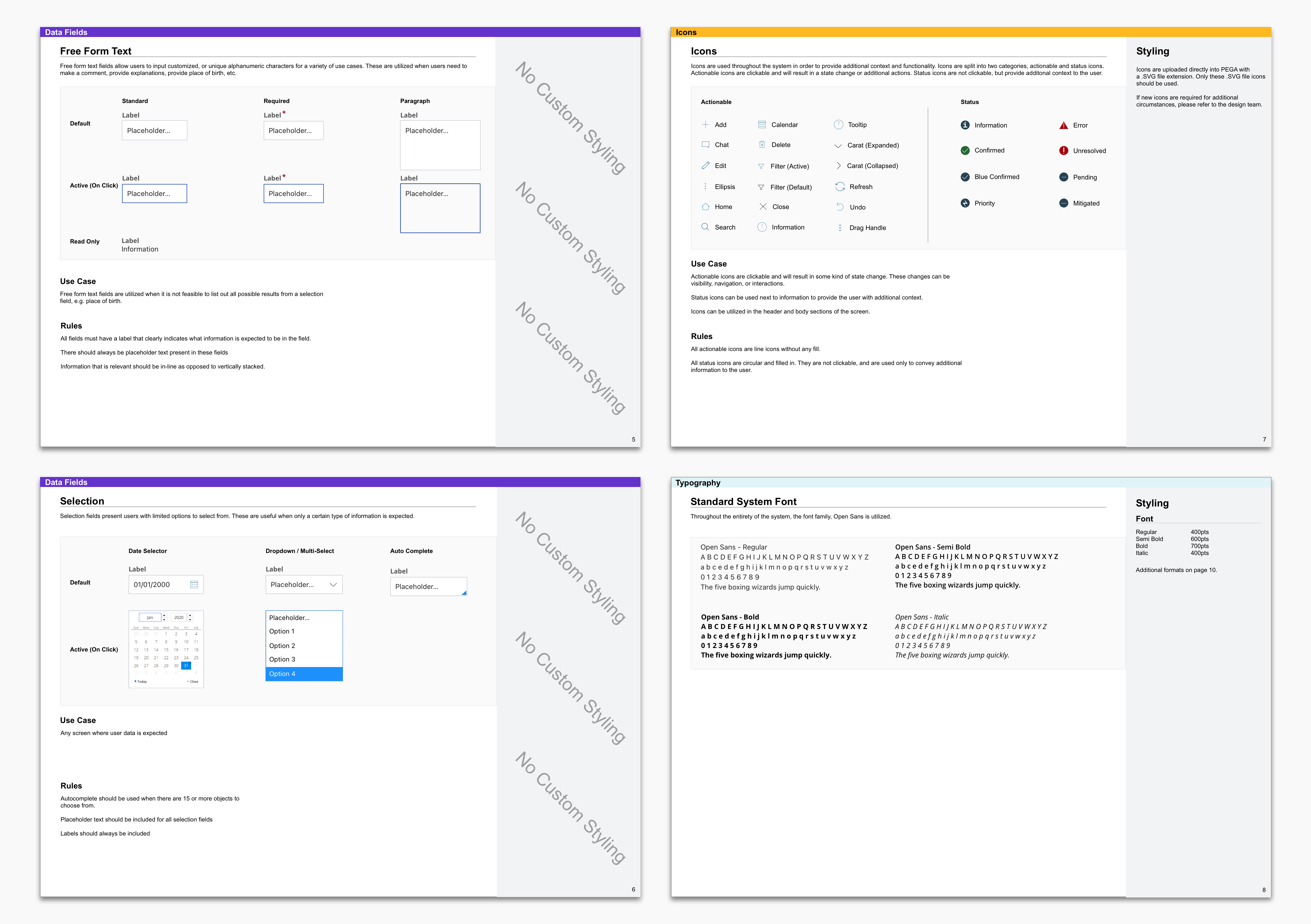
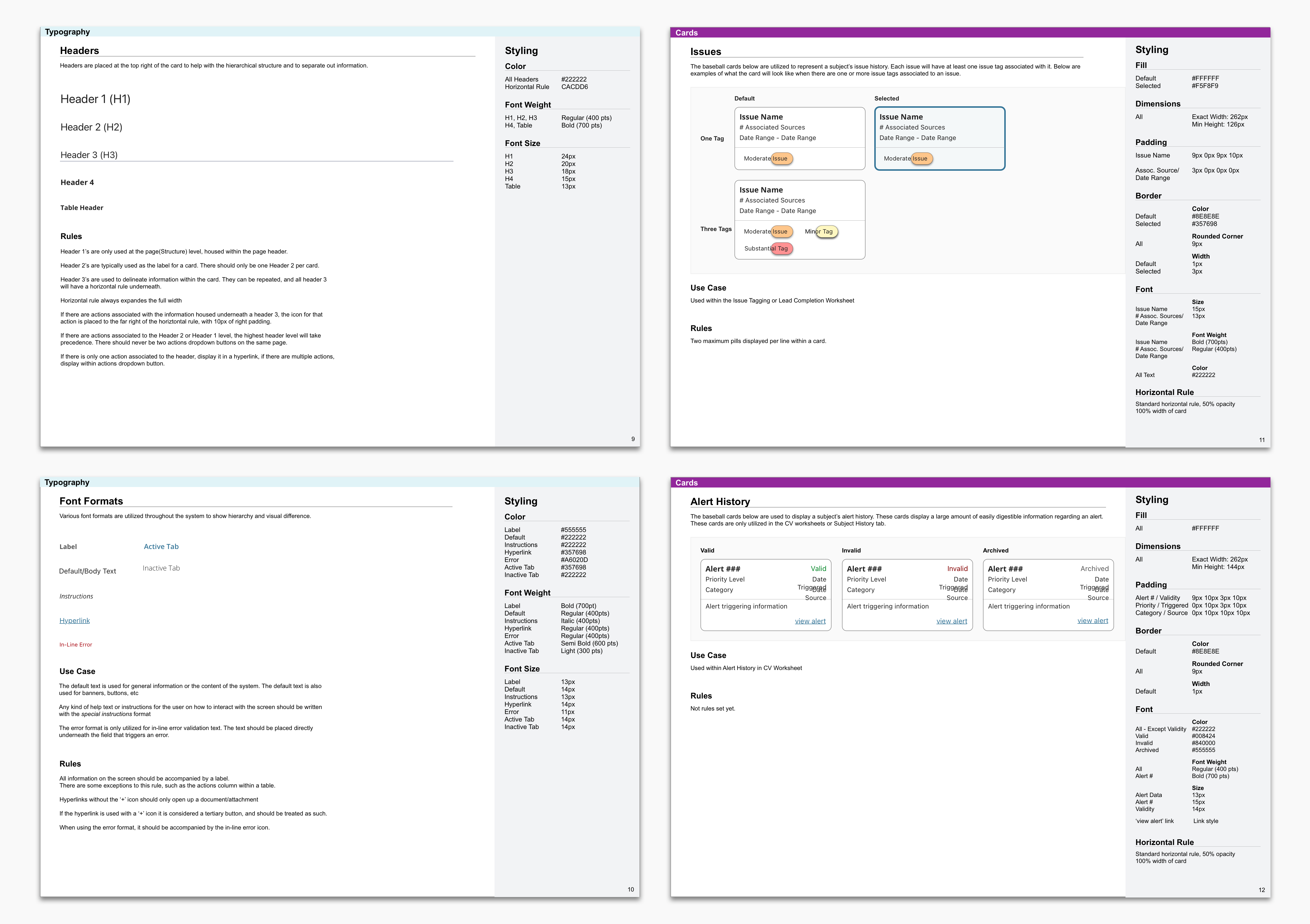
The final result was an extensive product design system that covers current and future state features, screen map, screen inventory, user interaction audit, user roles, patterns library, structures library, components library and design system. The screen map outlines the purpose of each element in the system and which users would access certain pages. Pages, tabs and modals were all documented on the screen map.
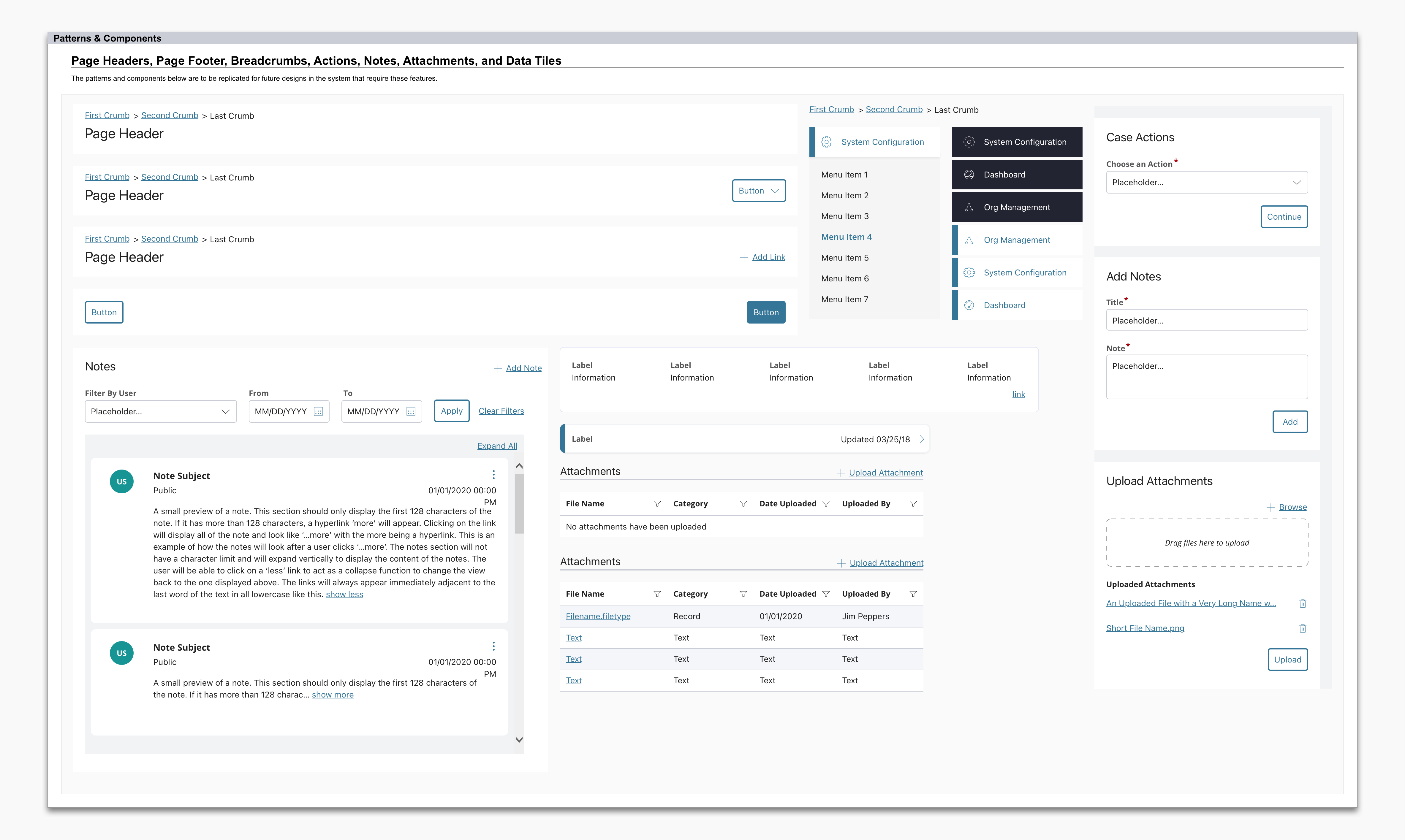
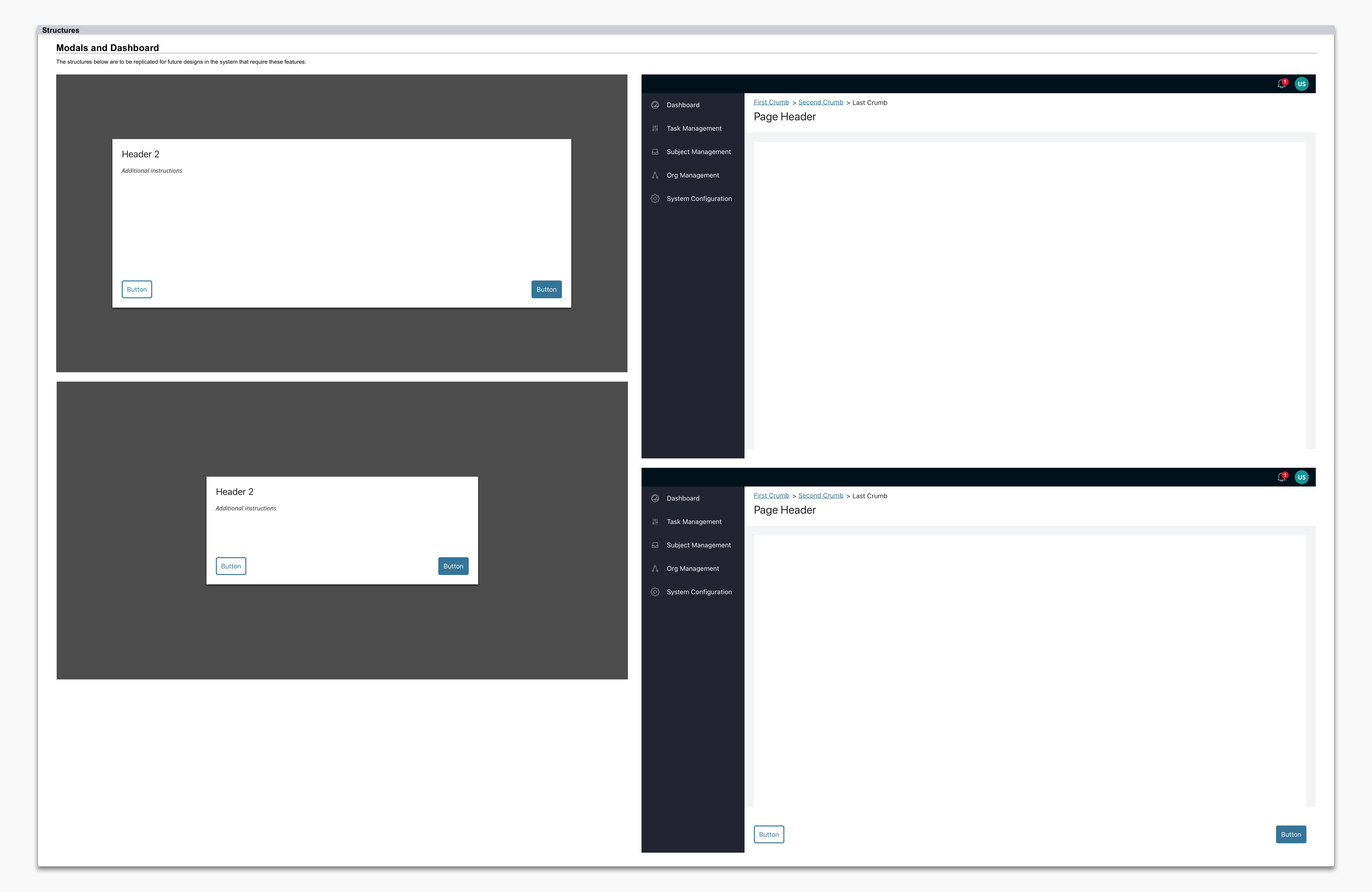
Any inconsistency in the current state was also identified and mitigated for the future state. Components, patterns and structures that reoccur often in the system were identified as additions to add into the design system library.
No 7Outcome
Inconsistency Mitigation
Identified and addressed inconsistencies in the current state, ensuring they were resolved for the future state.
Enhanced Design System
Expanded the design system significantly, aiding both the design team and developers in their ongoing work. Future design changes can be replicated and made quickly with the new components, patterns and structures.
Unified Understanding & Alignment
Achieved a unified understanding of the product’s current state and future direction among all stakeholders, product managers, development teams, and scrum teams, reducing confusion and misalignment. Reduced wasted development time around miscommunications. This ensured cohesive project progression.
Enhanced Collaboration
Improved collaboration and communication within and between teams, as the screen map served as a reference point for discussions and planning.
Strategic Roadmap
Provided a strategic roadmap that guided development efforts, helping teams focus on high-priority tasks and long-term goals. Resources can focus more time on complex problems and solutions instead of tweaking visual appearances.
Comprehensive Documentation
Produced a unique artifact that is a combination of a screen map, screen inventory, design system, user interaction audit, and roles key. The product design system functions as a single source of truth for design and development guidance.
No 8The Impact
This initiative expanded the current product design system even further as well as providing significant guidance to the design team and developers moving forward. It was a remarkable breakthrough that laid indispensable groundwork that the team utilizes to this day. With the product design system now amplified, it improved the product’s standardization, consistency and efficiency across all engineering teams. It provided designers with reusable components, patterns, and structures to improve the velocity of their workflow. As the product is in development, the product design system is continuously being updated and utilized. The product design system has supported the creation of 500+ wireframes.
No 9Reflection
It was a challenge at first, usually information architecture is created before a product is in development. It was unconventional to create information architecture midway through development. However, the team and I did our best to make it work. I’m glad we were able to identify the need for updating the product design system sooner rather than later.
I was pleased with how this project turned out. It has thoroughly mitigated the clients’ concerns. The team and I created a very unique deliverable that was a hybrid between a blueprint, a screen map, a user flow, design library and beyond. My favorite part was the purpose feature on the screen map as it provided the reason why something was necessary to develop. This will help project members better understand the product features. This artifact became invaluable in development efforts and allowed the teams to work more efficiently now that everyone is fully aware of where everything lives and breathes in the system.
Feedback from the team
“The effort you put in leading the screen map project. That work you did laid the groundwork for what we're doing today. You should be proud.” - Design Manager