TaskSync
task management
No 1 Overview
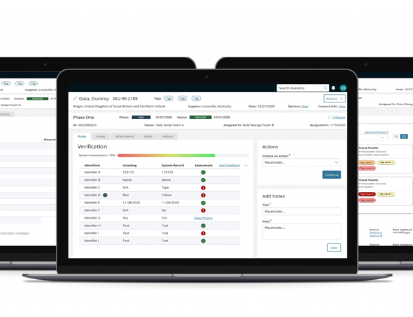
TaskSync is a task management software for internal use. It is designed for storing, assigning, creating and completing tasks within the system. For this case study the features include but are not limited to task reassignment, task list, and task list settings.
To comply with my non-disclosure agreement, I have omitted and obfuscated confidential information in this case study. Names have been changed for privacy as well. All information in this case study is my own and does not necessarily reflect the views of Accenture Song or Accenture.
ClientA government agency is developing a task management web based application for internal use by employees.
Design Team
1 Digital Producer, 1 Interaction Design Lead, 3 Interaction Designers, and 1 User Experience Designer (me), 2 Front End Developers
Project Type
Product design, User Experience design, User Interface design
Platform
Desktop web application
No 2 Client Requirements
User flows
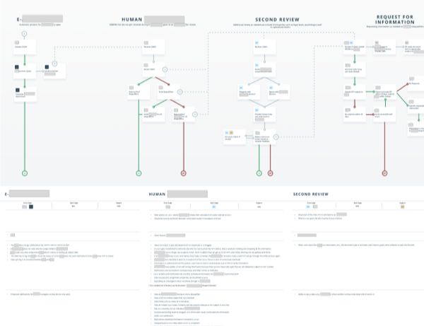
Provide user flows for viewing the task list, modifying the task list settings, and reassigning tasks
High fidelity wireframes
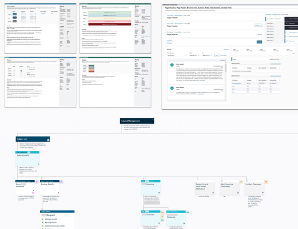
Provide comprehensive high fidelity wireframes to scrum teams to reference during development
Deliverables
User flows, high-fidelity wireframes
Product
High fidelity prototype and wireframes
No 3Challenges
Ensure Consistency Between Different User Flows
Maintain a uniform experience across various user flows, such as task list settings, task list viewing, and task reassignment. Each of these flows must feel interconnected and part of a cohesive whole.
Create a Cohesive Overall User Journey
Design an intuitive and cohesive user journey that guides users through the process of task management
Validate Design Feasibility for Users
Ensure the designs are visually appealing, practical and feasible for end-users. This involves validating that users can easily understand and interact with the features.
No 4The Approach
User Flows
Conducted brainstorming sessions to identify key user actions and scenarios within task management. Created screen flow diagrams to outline the steps users will take to manage tasks effectively.
Prototypes
Designed high-fidelity wireframes that represent the visual design and layout of the application. These wireframes serve as the basis for interactive prototypes. Presented the prototypes to stakeholders to gather initial feedback. This collaborative approach ensures alignment on design direction and addresses any concerns or suggestions early in the process.
Revised prototypes based on stakeholder feedback to refine the prototypes, ensuring they meet both user needs and business objectives.
Usability Testing
Led usability testing sessions with a group of users. During these sessions, I made observations and recorded how users interacted with the prototypes, noting any usability issues or areas of confusion.
Revise and Review
Analyzed the findings from usability testing to identify common issues and opportunities for enhancement. Made necessary modifications to the design based on these insights.
Presented the revised designs and observations made from usability testing to stakeholders for final review. This ensures that everyone is in agreement with the proposed changes and that the design aligns with business goals and user needs.
Hand off to developers
Once designs are approved by product owners, hand off the finalized designs to the scrum teams for development. Provided detailed design specifications and remain available for any clarification needed during the development process.
No 5My Process
The team and I worked with the technology consulting team in an "Agile-fall" process. We kicked off each feature with a list of requirements from the functional team, then iterated through low, medium, and high fidelity wireframes with daily collaboration from business analysts and developers. At the end of each release there was an enhancement period during which we revisited each feature to make tweaks and improve cross-feature consistency.
The two user groups that will be utilizing the task list are the staff members and supervisors. In order to create all the necessary screens for both groups. Based on the business requirements provided by the product owners, different scenarios were identified. Based on the user scenarios, I mocked up user flows for both user groups. With the user flows drafted, I was able to identify what screens needed to be designed. From there I began designing high fidelity wireframes with the aid of the design system.
The user scenarios include but are not limited to customizing the data shown on the task list, reassigning tasks to other users, viewing individual tasks assigned to the user, tasks assigned to the user's team and tasks assigned to user’s organizations as a supervisor.
Design Concepts
For the task list data customization flow, I included the function to save the data selection as a preset. This will allow the user to easily switch between different views of their task list at ease and having the selections saved prior will save them time in the future, allowing the user to work more efficiently. If a user didn’t want to save the selections as a preset, they have the option to decline this feature. The use case for having the preset allows the user to simultaneously switch the data presented in their task list quickly and look into the information they need to complete their tasks.
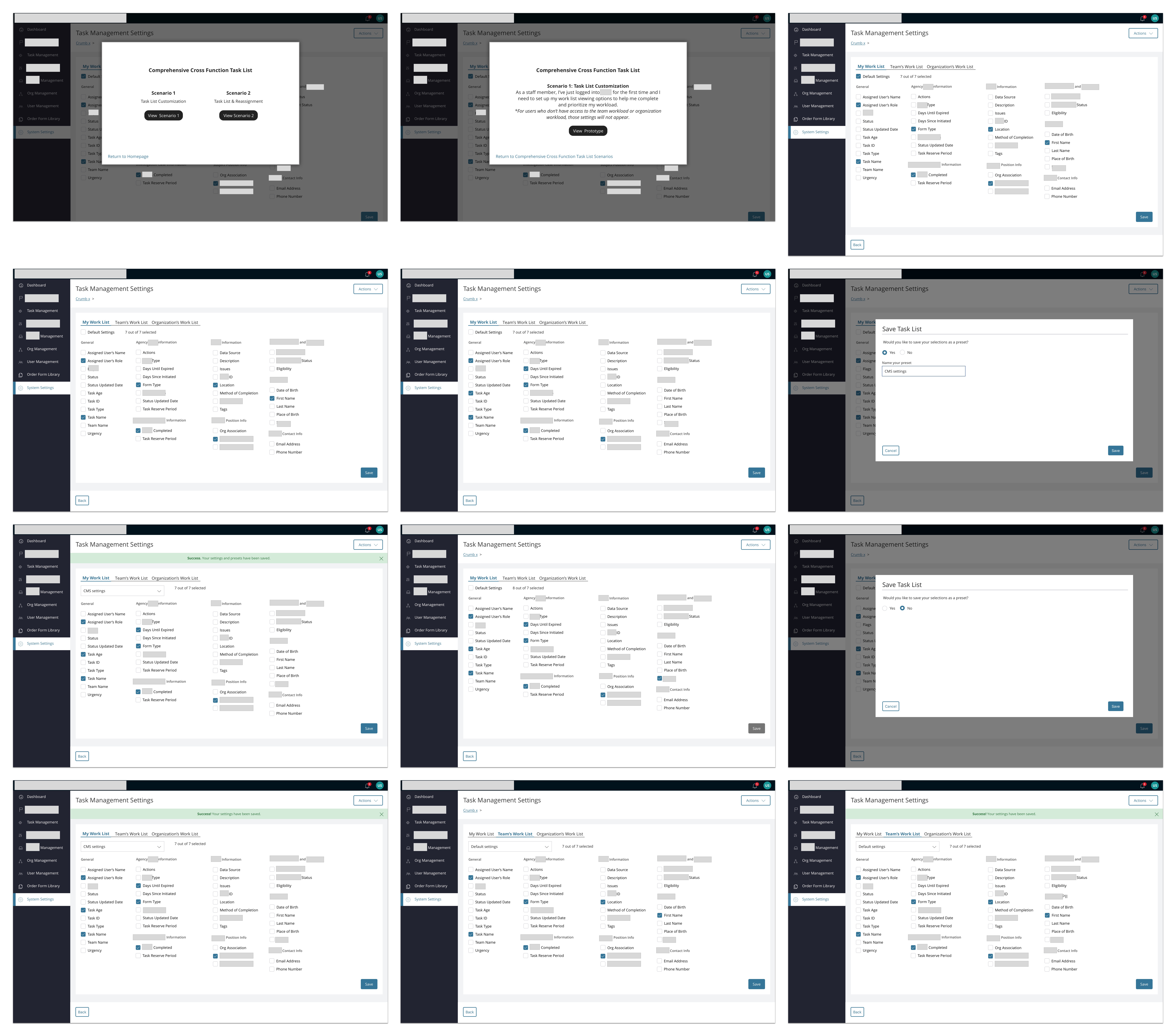
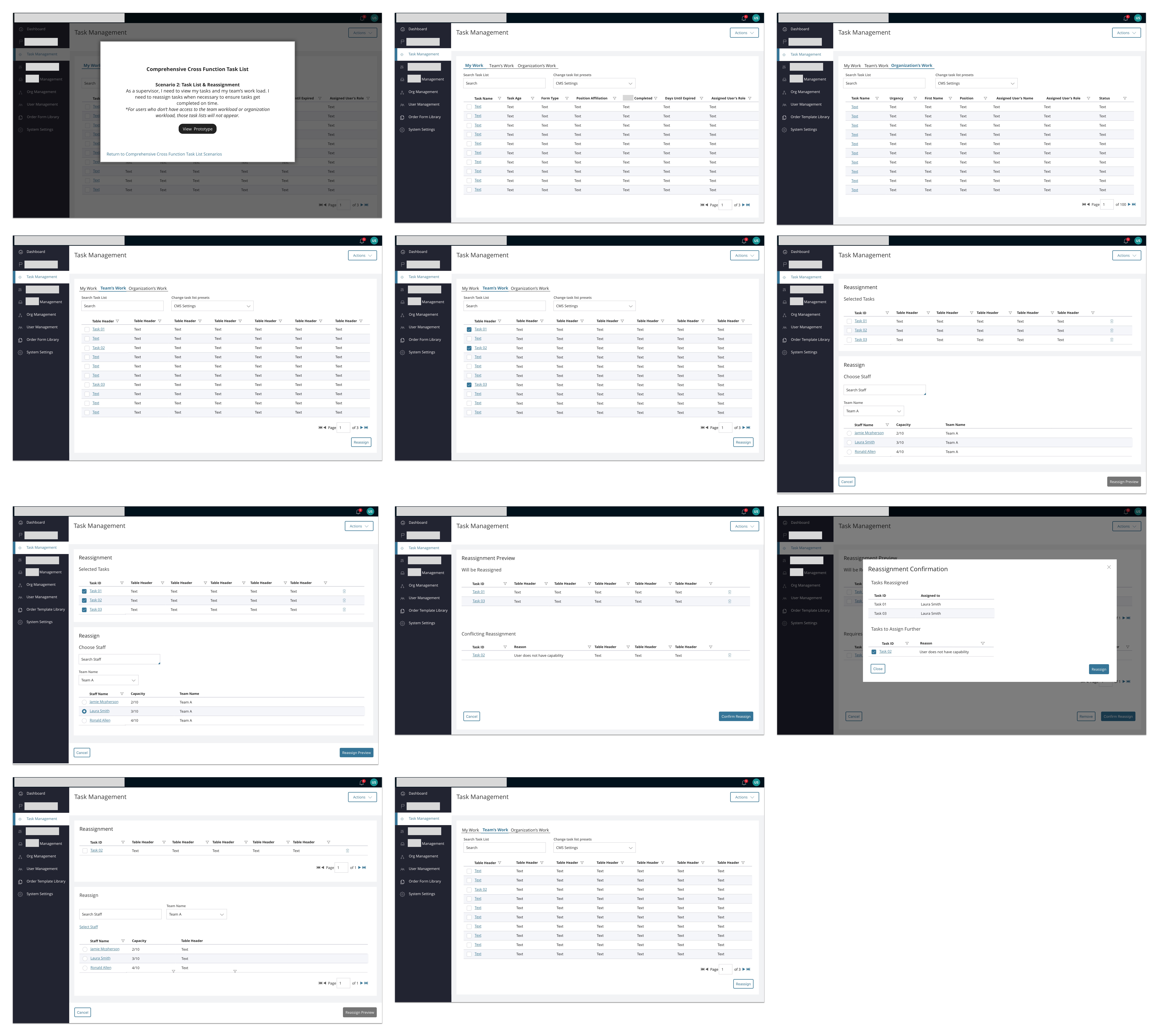
For the task reassignment flow, the user can select as many tasks as they want to reassign to another team member. They can only reassign it to one person at a time, I included the workload capacity so it can help the user make an informed decision of who has the bandwidth to take on more tasks. During the process of reassignment, if a team member was selected and was not qualified to complete the task due to lack of capabilities, the user will be prompted to select someone else. The tasks that can be reassigned will continue to be processed while the user selects another team member to reassign the remaining tasks.
A challenge I had while designing the task reassignment flow was determining whether or not a new window or modal would be used. While brainstorming, the team and I realized there were too many interactions occurring to put all this information into a modal. I decided modals should only be used for confirmation of an action. Another challenge was handling tasks that conflicted with being reassigned, I wanted to make sure those tasks don’t get lost or forgotten about if they did not meet the reassignment qualifications. Hence having the preview of what’s going to be reassigned and what tasks have a conflict will prompt the user to have this resolved immediately.
Certain users will have access to view their team’s task list or their company’s task list. This provides an overview of how much workload there is and allows teams and users to make an informed decision if the workload is too much or too little, this will help them plan accordingly on taking on more or less work for all staff members.
After the screens were designed, everything was transferred over to InVision for an interactive prototype and it was time to conduct user testing. The team and I recruited a handful of users from different departments at a company that will be switching over to this task management platform in the future. I conducted the sessions remotely with the users.
View prototypeUsability testing
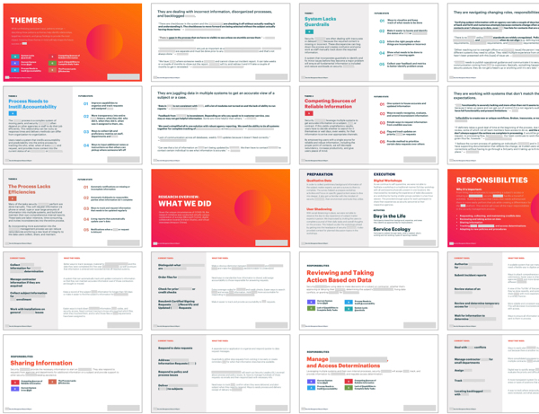
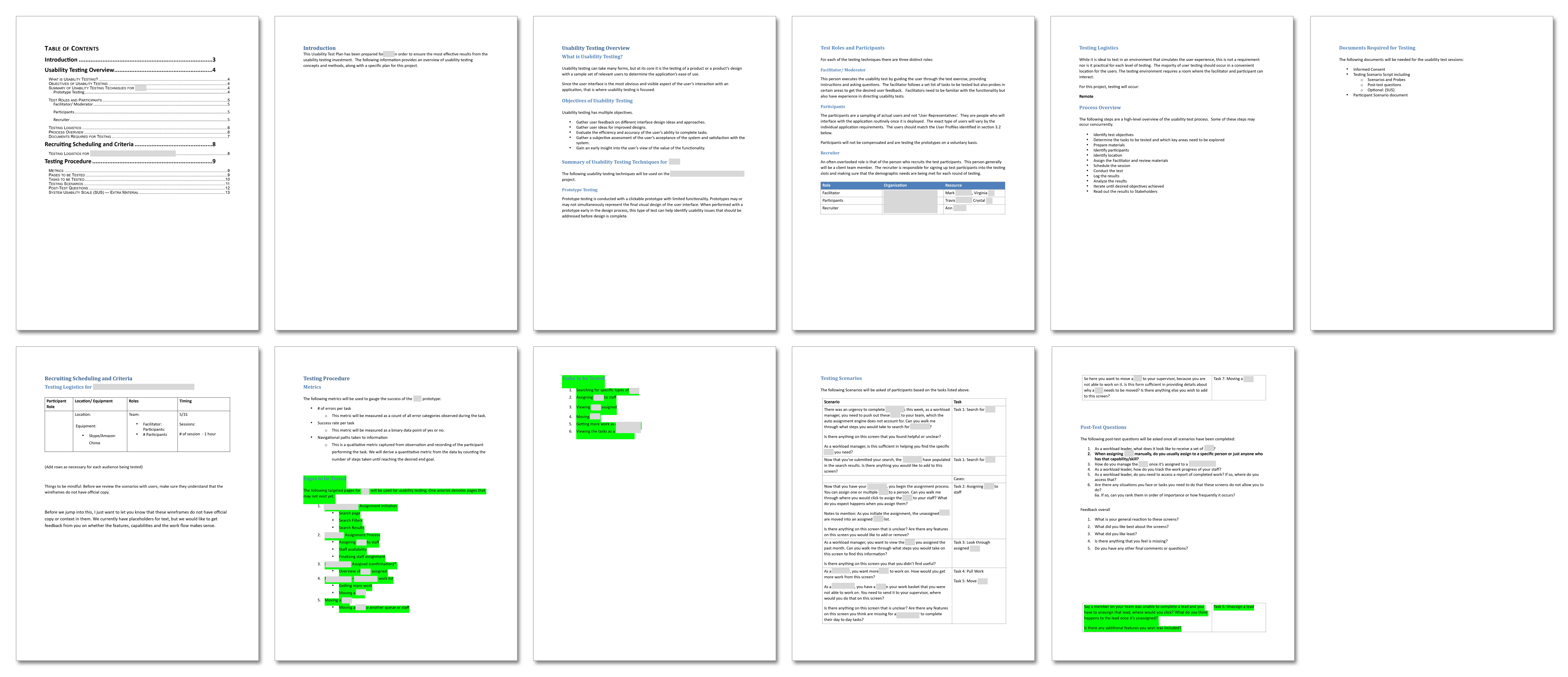
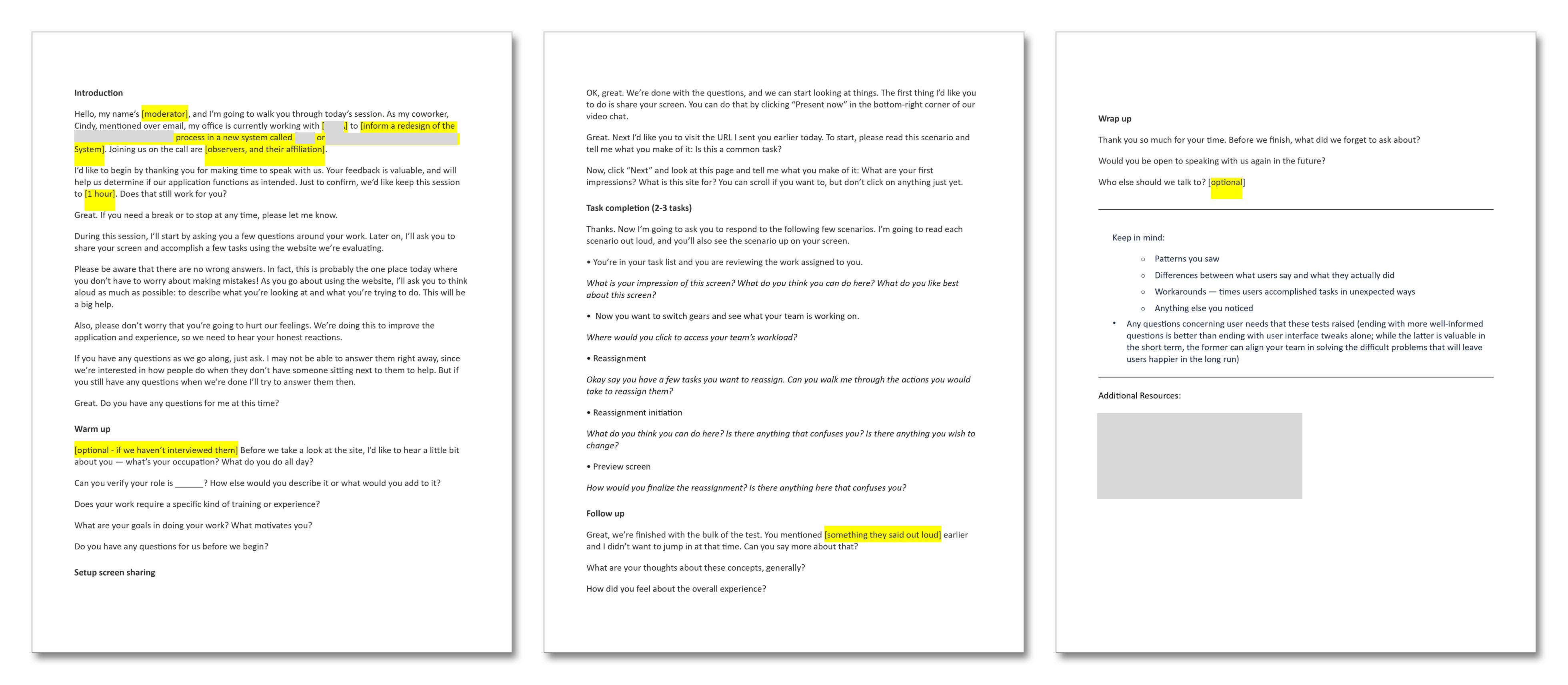
Prior to conducting user testing, I wrote a usability test script to assist in moderating the session. This helped the team prepare to speak with users in an efficient manner and to ensure we remained on topic. It allows the team and I to come in beforehand with questions and prompts for the users. The script was helpful in regulating the time and ensuring we get all our questions answered within the time frame and to be able to thoroughly go through the prototype with the users. By having the script in hand, the team was able to take turns and rotate in conducting usability testing sessions. We split the team into facilitators and note takers during the sessions. Since it was remote, we conducted a tech check a day prior to make sure everyone would not have issues with connecting to the calls or viewing the screen or hearing the audio.
Usability Test Plan
Usability Test Script
No 6Outcome
Overall the feedback we received was generally positive.
Task list Observations
Task list customization Observations
Task Reassignment Observations
We shared these observations with the product owners to discuss next steps regarding redesign.
Based on the responses received for the task list and reassignment, there was a need to redesign some of the areas. For the task list, task urgency will be included so users can plan their workload accordingly. For reassignment, a comment box will be included when a task is reassigned to another staff member for transparency and awareness between staff members.
Due to time constraints and working in 2 week sprints within a 10 week product increment, there wasn’t enough time to redesign reassignment to include features like reassigning multiple singular tasks to different staff members simultaneously or having an override feature for conflict in reassignment.
It was noted to change the reassignment rules to a user group or user type instead of an individual.
Overall, the usability results had validated most of the design concepts for task list, task list customization settings and task reassignment. It provided future opportunities in areas we could refine better to fulfill the needs of our users.
Notes from User Testing

No 7Reflection
There were some challenges at first when it came to designing the flow for reassignment. The other flows were simpler concepts to design, the team and I were able to get most of the requirements from our team of business analysts and product owners. In the future, I would like to do more usability testing with these designs with a bigger user group. It would be beneficial to hear from more people from different companies and backgrounds. It would ensure these designs are bullet proof in providing everything they need. What I’ve learned from this is through our agile ways of working, nothing is entirely finalized and there will always be room for improvement and refinement. I hope as development continues, we will get closer and closer each time to creating the best user experience for our users.
